The short version
In 1899 Elizabeth Wells Gallup said the First Folio carried a hidden message in the shapes of its italic letters: two founts so alike that no reader notices, alternating to spell a binary code Bacon had described in 1623. In 1916 her employer, Riverbank Laboratories, published three booklets explaining how she did it. One of them, The Keys, has been this project’s instrument since the second of September. The other two — The Greatest Work of Sir Francis Bacon and Hints to the Decipherer — were read this weekend, from the plate images, page by page.
They turn out to say two things this project has been trying to establish by measurement. First, how the forms were found: by assigning letters, checking whether the group of five decoded, and when it did not, redefining the forms. Second, how the forms are to be told apart: a list of rules, one of them a number. Every rule that can be turned into a measurement was then measured on the Prologue to Troilus and Cressida — the page Riverbank chose — against the marks Riverbank printed.
Questions
What is the biliteral cipher?
Sir Francis Bacon described it in 1623. Every letter of the alphabet becomes a group of five symbols, each symbol either an a or a b — binary code, three centuries before binary code.
The two symbols need not be letters at all. They can be two founts of type so similar that a reader notices nothing. Print an innocent passage in an alternating mixture of the two, and the shapes of the letters carry a second message underneath the first.
What was done over these two days, in plain terms?
Two of Riverbank’s 1916 booklets had not been read. They were fetched from New Gorhambury, where they are kept as page images, and read from the plates rather than from any machine transcription — a rule this project adopted after a text layer put words into Riverbank’s mouth last week.
One booklet, Hints to the Decipherer, contains the only list Riverbank ever published of how to tell the two forms apart. Each rule on that list that can be turned into a number — lean, height, position above the baseline, ink weight, the direction of a tail or a serif, the position of the dot on an i, the shape of a counter, the length of a crossbar — was measured on every verified glyph of the Prologue and compared with the mark Gallup gave that glyph. The marks come from a table the other booklet prints: the whole Prologue in groups of five with its a/b code, which agrees with the marking this project has used since the second of September in all 1,070 places.
What do Riverbank’s own books say about how the forms were found?
More than a critic would dare to put in their mouth. The Greatest Work (p. 8): “Frequently a letter would be assigned during the examination to the a or to the b form only to find that such assignment resulted in a combination which was meaningless, when the group of five to which it belonged was compared with the key. Further examination and comparison were then of course necessitated, and a redefinition of characteristics of the respective forms followed.”
And Hints (p. 11), on Gallup’s early practice of leaving doubtful letters “to be accomplished later, by the assistance of the context”: “This plan, though legitimate, is, of course, unscientific, and too much open to adverse criticism to be satisfactory as anything more than a temporary expedient. It must be altogether eliminated from any permanent system of decipherment.”
That is the circularity this project has been measuring, stated in print by the people who did the work. The replacement they proposed for it is the quadrant rule.
What is the quadrant rule, and did it work?
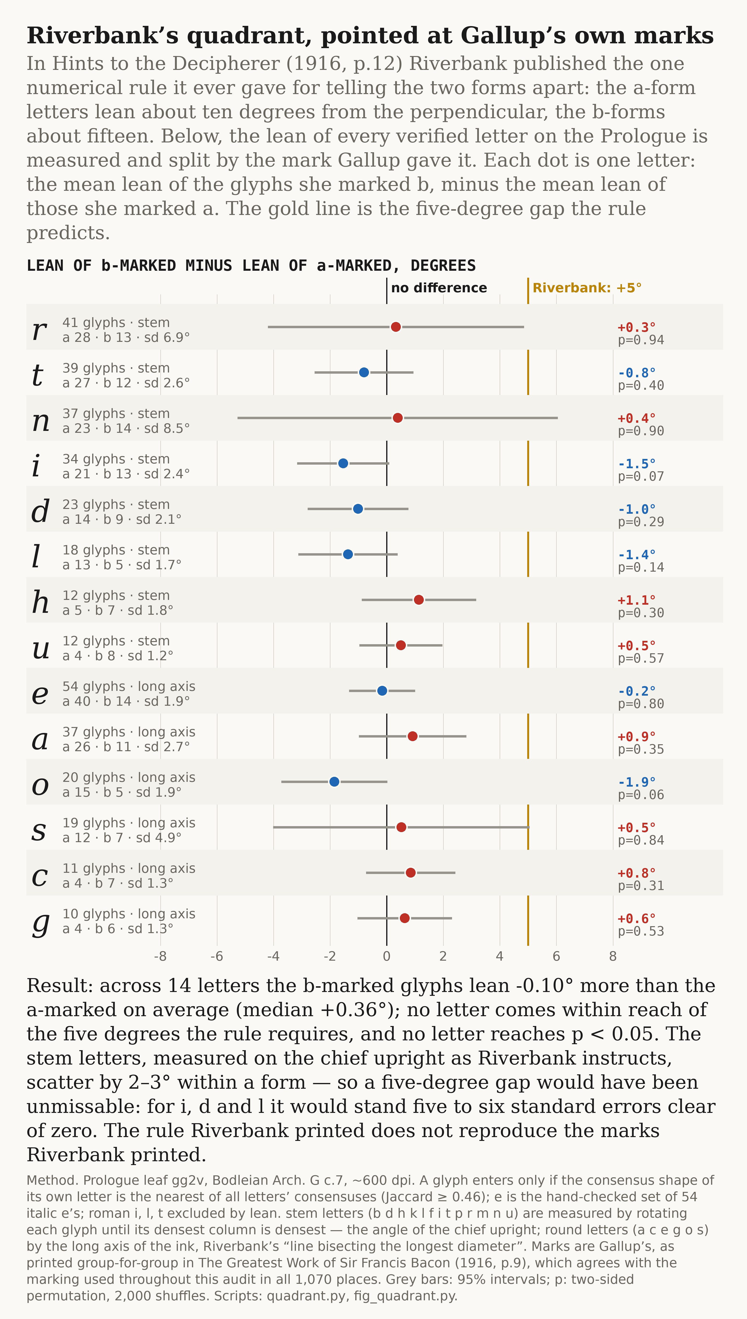
“As a rule the a-form letters show an angle of about ten degrees between their chief upright lines and the perpendicular, while the b-forms show a slope of about fifteen degrees.” The decipherer was to equip himself with “a small quadrant or projector, a fine 4-inch rule, or some cards cut to right angles.” It is the one place in all three booklets where a number is offered.
It does not work on the page it was written for. Measured on the chief upright of every stem letter and on the long axis of every round one, the b-marked glyphs lean a tenth of a degree less than the a-marked, averaged over fourteen letters, and a third of a degree more by the median. No letter comes within reach of five degrees; for o and i the difference runs the wrong way. The scatter within a letter is two or three degrees, so a five-degree gap would have been unmissable. The rule Riverbank printed does not reproduce the marks Riverbank printed.
And the other rules?
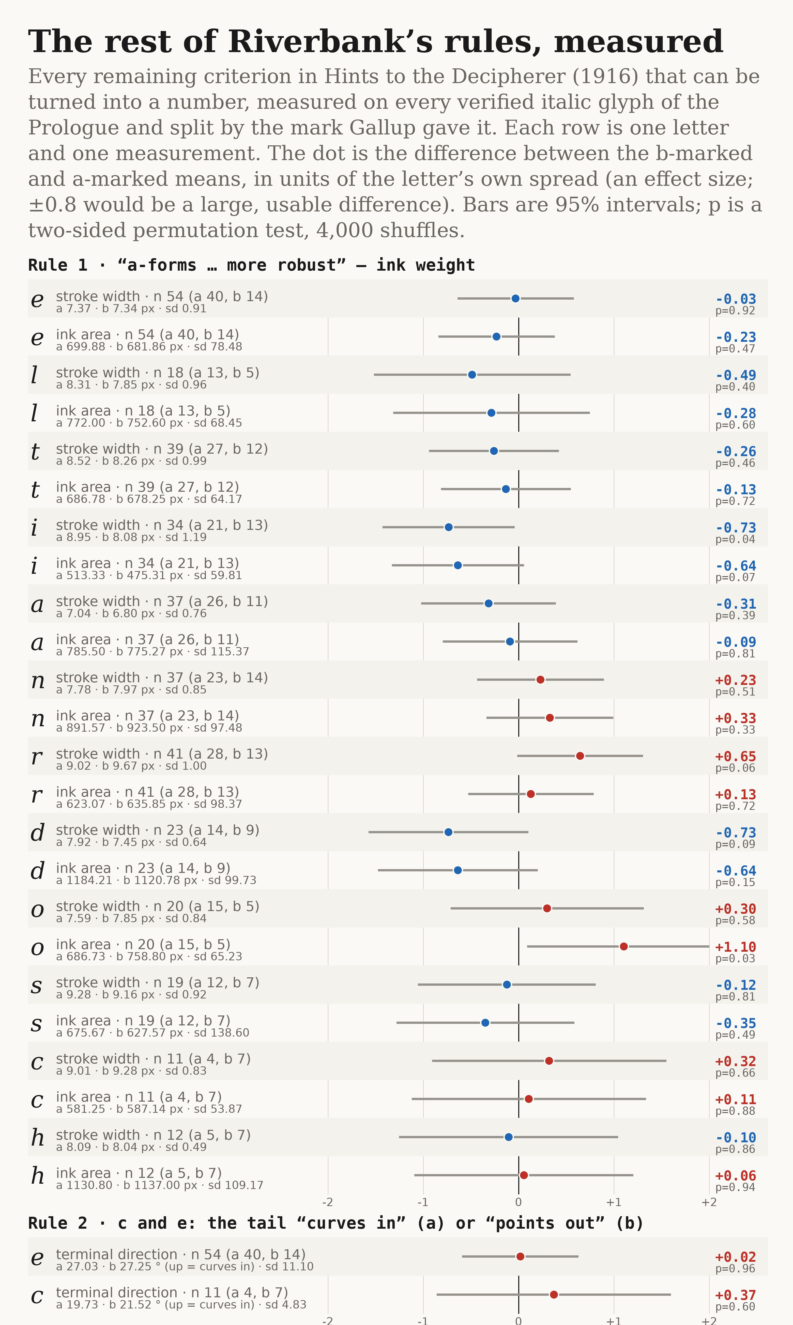
The booklet lists eleven in all: the a-forms “larger, rounder, more upright, and more robust”; the tail of c and e curving in for one form and pointing out for the other; the serif strokes of i, m, n, u; long-tailed letters sloping more; circular letters judged by the slope of their longest diameter; the quadrant; letters standing above the baseline; the last stroke of m and n shortened; the position of the dot on i; a line through the counter of a, b, d, g, o, p; the top serifs of tall letters and the cross-strokes of f and t.
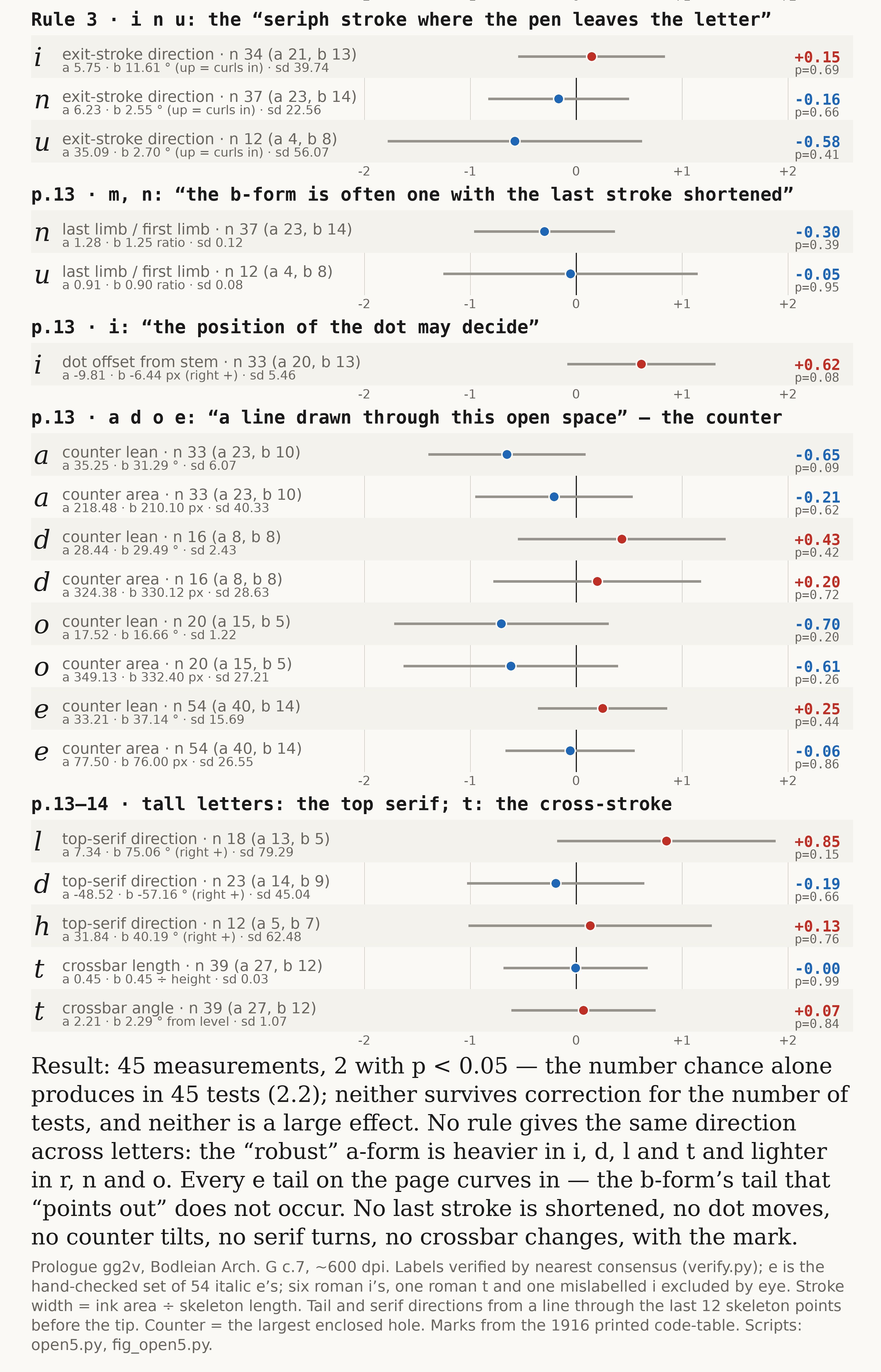
Ten of the eleven have now been measured on the Prologue and none follows the marks. Every e tail on the page curves in; the “pointing out” form does not occur. Every letter sits on its baseline to within a twelfth of a millimetre whichever way it was marked. Forty-five separate measurements produced two at the conventional threshold, which is what forty-five measurements produce by chance. The eleventh rule, on long-tailed letters, needs more glyphs than this page has.
Is anything still standing?
The lower-case w. On the Prologue its five a-marked glyphs are 45 pixels tall and its three b-marked 56, with nothing between: on the scale used for every chart above, an effect of two, where nothing else on the page passes one. It separates by height and by the shape of its counter — features that Riverbank’s written rules, as it happens, never mention.
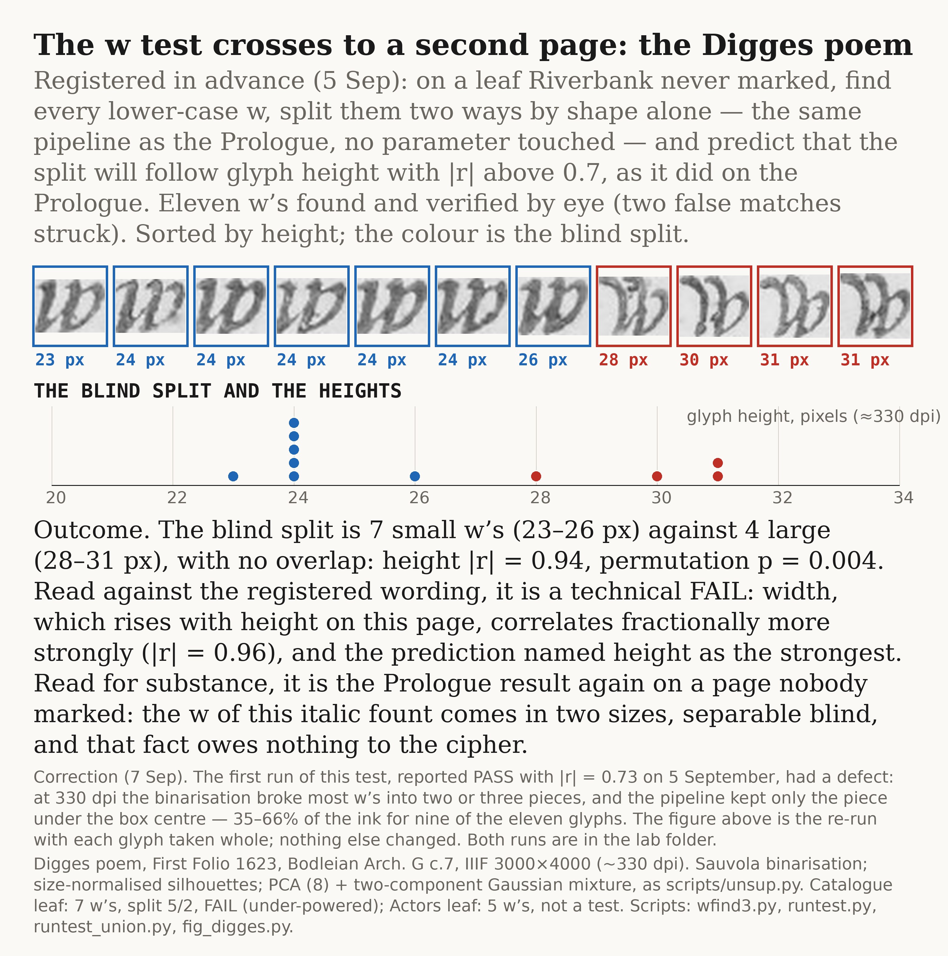
And it holds on a second page, with a correction. The Digges poem’s eleven w’s, taken whole, fall into seven small and four large with no overlap in height. Two sorts of w in this italic is now the best-supported fact in the file. It is also exactly what a printing house with two cases of type would produce, and it says nothing about any other letter.
You found a mistake in your own earlier result. What happened?
The 5 September Digges test was run on a lower-resolution scan than the Prologue, and at that resolution the step that turns the photograph into black-and-white broke most w’s into two or three pieces. The pipeline then kept only the piece under the centre of each box — between a third and two thirds of the ink for nine of the eleven glyphs. The reported pass was computed on fragments.
It came to light while this report was being assembled, because the figure needed the glyphs drawn and the drawn glyphs were plainly incomplete. Re-run on whole glyphs, the split is cleaner than before but width edges out height as its strongest correlate, and the prediction registered in advance named height. So the honest record is: a technical fail on the registered wording, a stronger result in substance, and both runs kept. That is the format working as intended.
What would change your mind?
In either direction. A second letter that separates on the Prologue the way w does, by any rule at all, measured before anyone looks at the marks. Or the w split failing to appear on the Catalogue and Actors leaves once enough glyphs are found there. Or Riverbank’s per-passage Classifier plates, which have not yet been extracted, showing two forms for e where their descriptive plates show one.
What would not change it is another way of reading the marks. The marks are fixed; they were printed in 1916 and confirmed twice.
Who is doing this and why?
Walter Wilkinson, Worland, Wyoming. The sister strand is the Word Cipher work published alongside this.
The reason it has merit is that the question has stayed arguable for 127 years purely because nobody measured it. The photographs went online free; the statistical machinery got built for another purpose; and it turns out the claimants themselves left a list of what to measure. The wider project lives at New Gorhambury, and its Experiment One. Worth knowing before you read them: those pages argue a conclusion. These reports deliberately do not.
External documents
Every source relied on, with what it is and where the original lives. All are free and public.
Technical colophon
Everything below was produced on 6 and 7 September 2026 from free files: the Bodleian’s image service, The Keys for Deciphering on archive.org, and the two Riverbank booklets kept as page images at New Gorhambury. Every number can be re-derived from them.
The two booklets, and how they were read
Both are LuraDocument scans of Library of Congress copies: a 100-dpi colour background and a 300- or 400-dpi text mask. Every passage quoted was read from a 200-dpi render of the plate, never from the embedded text layer, which for these scans is garbage (“t^Greatest Work”). Printed page equals PDF page minus 2 for The Greatest Work and minus 4 for Hints. Fetching them needed a workaround: neither of this project’s sandboxes may reach gorhambury.org, so the three PDFs were pulled through the browser, one per fresh tab, and staged from the desktop.
⚑ The printed code-table, against our marks
Page 9 of The Greatest Work prints the Prologue as 214 five-letter groups, each over its code — ThePr / aabab, ologu / baaaa, …, ofWar / aaaaa, with re left over as nulls. All 214 were transcribed from the plate at 400 dpi and decoded with Bacon’s 24-letter alphabet:
FRANCIS ST ALBAN DESCENDED FROM THE MIGHTY HEROES OF TROY LOUING AND REUERING
THESE NOBLE ANCESTORS HID IN HIS WRITINGS HOMERS ILLIADS AND ODYSSEY IN CIPHER
WITH THE AENEID OF THE NOBLE UIRGIL PRINCE OF LATIN POETS INSCRIBING THE
LETTERS TO ELIZABETH R F ST A

groups                     214      letters on the page   1,072 (1,070 coded + 2 nulls)
codes equal to align.json  1,070 of 1,070
message equal to ours      214 of 214   (U/V spelling only)
The marking this project has used since 2 September was derived from the Keys. It is now confirmed by an independent 1916 printing in every position. Everything below is scored against it.
⚑ Label verification, tightened
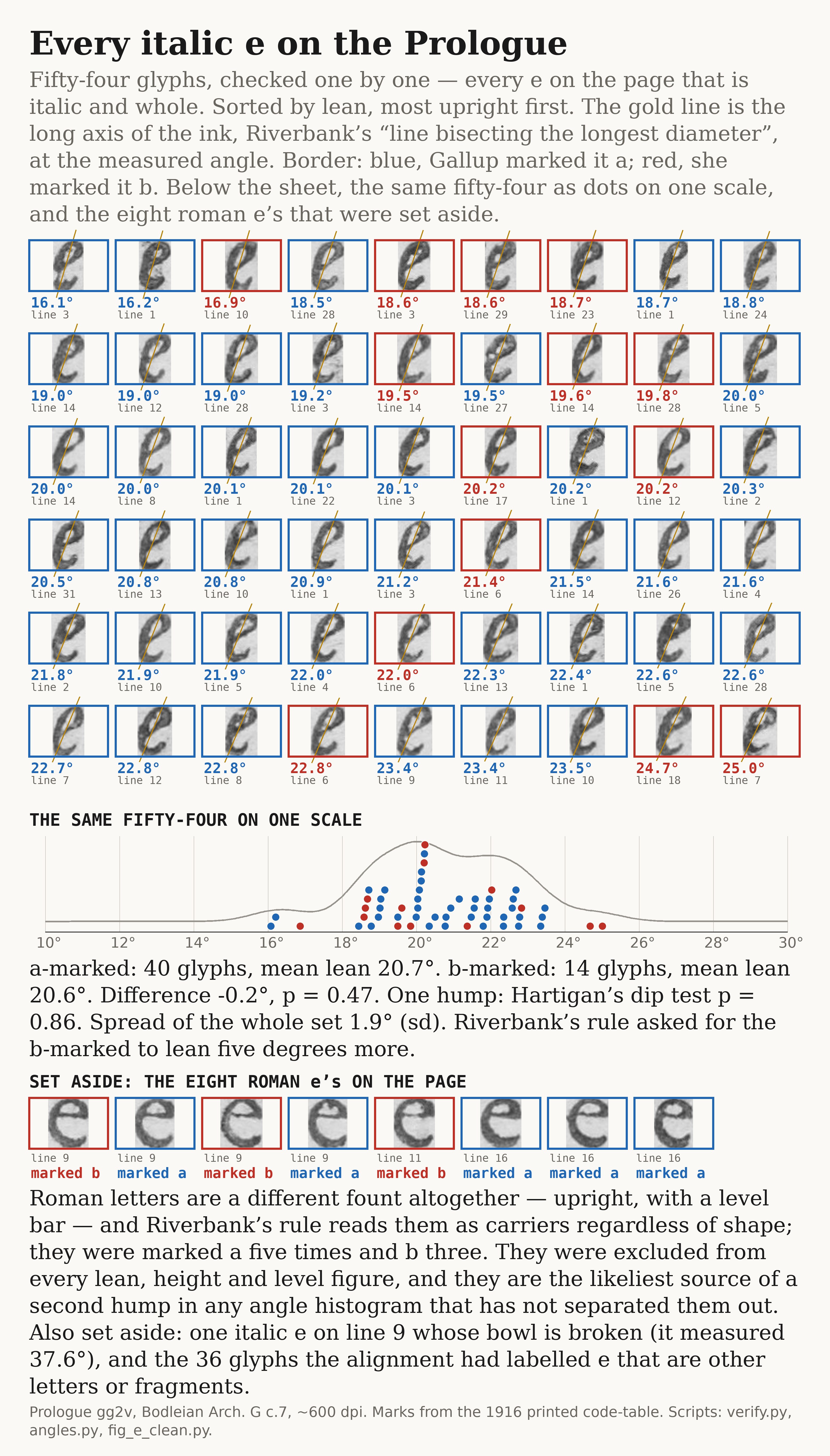
Last week’s per-letter statistics used labels from the page alignment checked only against each letter’s own consensus shape. A sheet of every glyph labelled t showed long-s, r, e and a among them. The check was rebuilt: a glyph keeps its label only if the consensus of its own letter is the nearest of all letters’ consensuses (Jaccard ≥ 0.46), with long-s split from round s by height first.
letter   labelled  verified   commonest wrong labels page-wide
e            99        54     e→n 10   i→t 8   n→w 7   i→e 6   t→o 5
t            72        40
i            65        40
r            64        41
a            58        37
n            59        37
d            37        23
l            35        18
h            28        12
Then by eye. The 54 verified e’s and the 45 rejects were laid out and inspected one by one: one verified glyph struck (a broken bowl, line 9, which measured 37.6°), one genuine italic e recovered from the rejects, and eight roman e’s found among the rejects — lines 9, 11 and 16, marked a five times and b three. Six roman i’s and one roman t were found the same way among the verified sets and excluded. Roman letters are a different fount, upright, and Riverbank’s rule reads them as carriers regardless of shape; they are what a second hump in an angle histogram most likely is.
⚑ The quadrant test
Two lean estimators, both on the binarised ink at ~600 dpi. Stem letters (b d h k l f i t p r m n u): rotate the glyph in half-degree steps until its densest pixel-column is densest — the angle that makes the chief upright vertical, which is Riverbank’s instruction. Round letters (a c e g o s): the long axis of the ink from the pixel covariance, Riverbank’s “line bisecting the longest diameter”. Positive is a rightward lean. Split by mark; difference of means; two-sided permutation p, 2,000 shuffles.
letter   n     measure   a-marked   b-marked   b − a    sd     p
i       34     stem       19.1        17.6     −1.5    2.4   0.07
t       39     stem       15.9        15.1     −0.8    2.6   0.40
r       41     stem       32.3        32.7     +0.3    6.9   0.94
n       37     stem       32.9        33.3     +0.4    8.5   0.90
d       23     stem       11.8        10.8     −1.0    2.1   0.29
l       18     stem       16.3        14.9     −1.4    1.7   0.15
u       12     stem       38.1        38.6     +0.5    1.2   0.57
h       12     stem       15.5        16.6     +1.1    1.8   0.30
e       54     axis       20.7        20.6     −0.2    1.9   0.80
a       37     axis       30.0        30.9     +0.9    2.7   0.35
s       19     axis       14.6        15.1     +0.5    4.9   0.85
o       20     axis       11.4         9.5     −1.9    1.9   0.06
c       11     axis       17.7        18.5     +0.9    1.3   0.31
g       10     axis       15.4        16.0     +0.6    1.3   0.53

Riverbank predicts b − a = +5° for every letter.
observed across 14 letters: mean −0.10°, median +0.36°
positive in 8 of 14 · none p < 0.05 · none near +5°
Labels as verified above; the table was first computed on the older check and re-run, which changed no conclusion but halved t’s scatter (5.2° to 2.6° — the tail was long-s and r labelled t). Absolute leans agree with the fount slope found earlier from 124 ascenders (14.1°): l 16°, h 16°, t 15°, d 11°. The stem estimator on r, n, u locks onto the arch rather than the stem (32–38°); the difference between marks is what is tested, and it is null there too. The within-form scatter of 1.7–2.6° for l, d, h, i means a five-degree gap would have stood five to six standard errors clear of zero.
⚑ Bimodality, without the marks
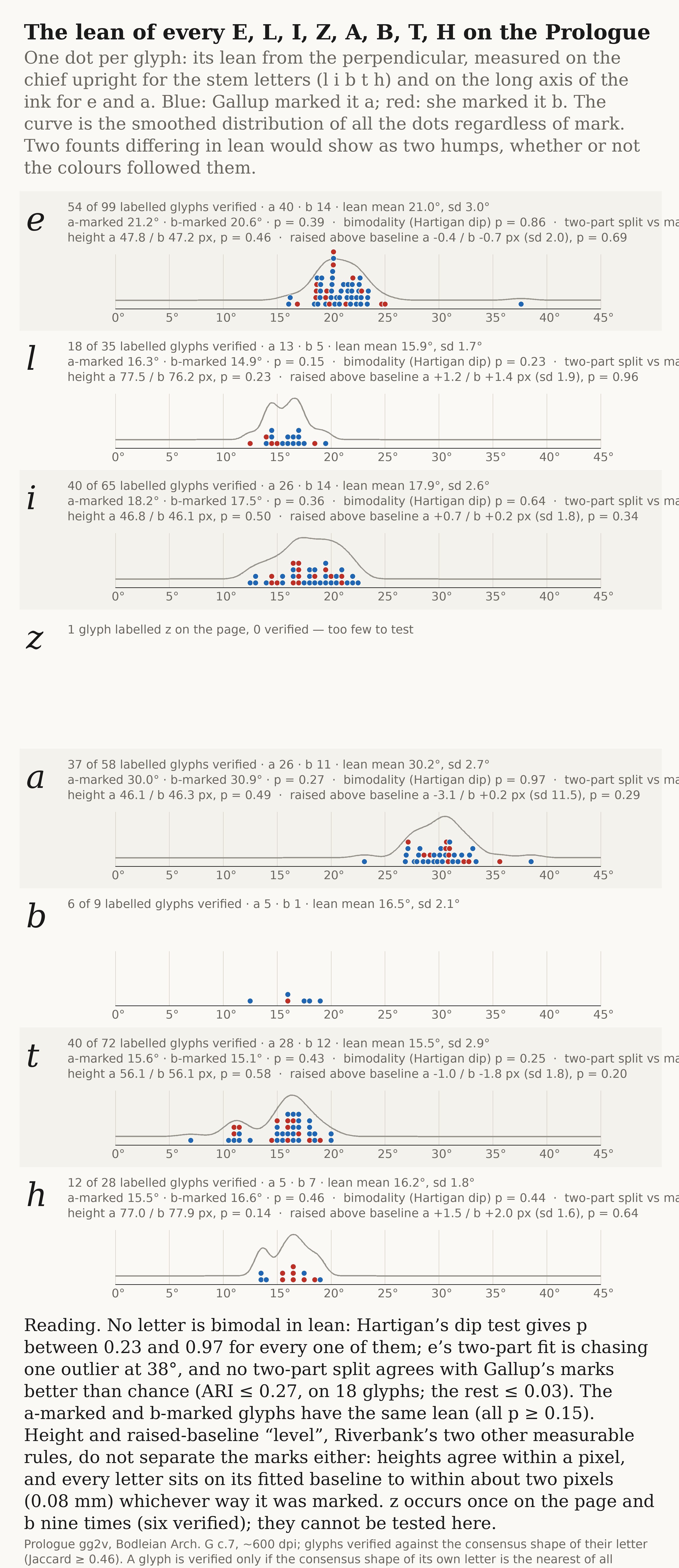
Walter’s point, and the better question: two founts differing in lean would show as two humps whether or not the marks followed them. For E L I Z A B T H, every verified glyph’s lean was tested with Hartigan’s dip and with a one- against two-component Gaussian mixture; where two components were preferred, their split was scored against the marks by adjusted Rand index.
letter   n    dip p   two-part split vs marks (ARI)    note
e       54    0.86        −0.02     one outlier at 38° drives ΔBIC
l       18    0.23        +0.27
i       40    0.64        −0.00
a       37    0.97        +0.00
t       40    0.25        −0.00     six genuine t at 10–12°, marked 3 a / 3 b
h       12    0.44        +0.40
z        1      —            —      one glyph on the page
b        6      —            —      five marked a, one b
The one real structure is in t: a minor upright group of six against the main body at 14–20°, marked three and three — a real variation in the sort, indifferent to the cipher classes, and the kind of thing a hand and a glass would seize on.
⚑ Height and level
The stencil pipeline, by cropping each glyph to its own box, had thrown away where the glyph sat on the line — Riverbank’s “out of alignment” rule (Hints p. 13). Measured now from page coordinates: a Theil–Sen line fitted through the bottoms of each line’s non-descending letters, so page skew is handled, and each glyph’s bottom taken relative to it.
letter   height a / b (px)   p       level a / b (px)   sd    p
e        47.8 / 47.2       0.46     −0.4 / −0.7        2.0  0.69
l        77.5 / 76.2       0.23     +1.2 / +1.4        1.9  0.96
i        46.8 / 46.1       0.50     +0.7 / +0.2        1.8  0.34
a        46.1 / 46.3       0.49     −3.1 / +0.2       11.5  0.29
t        56.1 / 56.1       0.58     −1.0 / −1.8        1.8  0.20
h        77.0 / 77.9       0.14     +1.5 / +2.0        1.6  0.64
Heights agree within a pixel. Every letter sits on its fitted baseline to within about two pixels — 0.08 mm — whichever way it was marked. The rule has nothing on this page to act on.
⚑ The rest of the rules: forty-five measurements
Each remaining rule was turned into one number per glyph. Ink weight: mean stroke width (ink area ÷ skeleton length) and ink area, twelve letters. Tail direction of e and c: a least-squares line through the last twelve skeleton points before the lower-right tip, angle from horizontal, rising = “curves in”. Exit-stroke direction of i, n, u: the same at their lower-right tip. Last limb of n and u: column-height of the right 30% over the left 30%. i-dot: the dot’s centroid against the stem line extended upward at the stem’s own lean, in a window reaching 70% of the glyph height above the box. Counters of a d o e: lean of the long axis and area of the largest enclosed hole. Top serif of l d h: direction of the stroke arriving at the topmost skeleton endpoint. t crossbar: the widest row run in the top 45% of the glyph, its length over height and its angle. Effect size d = (b-marked mean − a-marked mean) / sd; permutation p, 4,000 shuffles.
rule                                   letters       |d| max   p min    p < 0.05
1  “more robust” — stroke width, area   e l t i a n r d o s c h   1.10    0.032   2 (i width, o area)
2  e/c tail curves in / points out      e c                       0.37    0.60    0
3  serif exit stroke                    i n u                     0.58    0.41    0
8  last stroke shortened                n u                       0.30    0.39    0
9  i-dot position                       i                         0.62    0.08    0
10 counter line                         a d o e                   0.70    0.09    0
11 top serif; t cross-stroke            l d h t                   0.85    0.15    0

45 tests · 2 at p < 0.05 · expected by chance 2.2 · none survives correction
no rule keeps its sign across letters: the “robust” a-form is heavier in i d l t, lighter in r n o
every e tail on the page rises toward its tip — the “points out” form does not occur
⚑ The stress axis
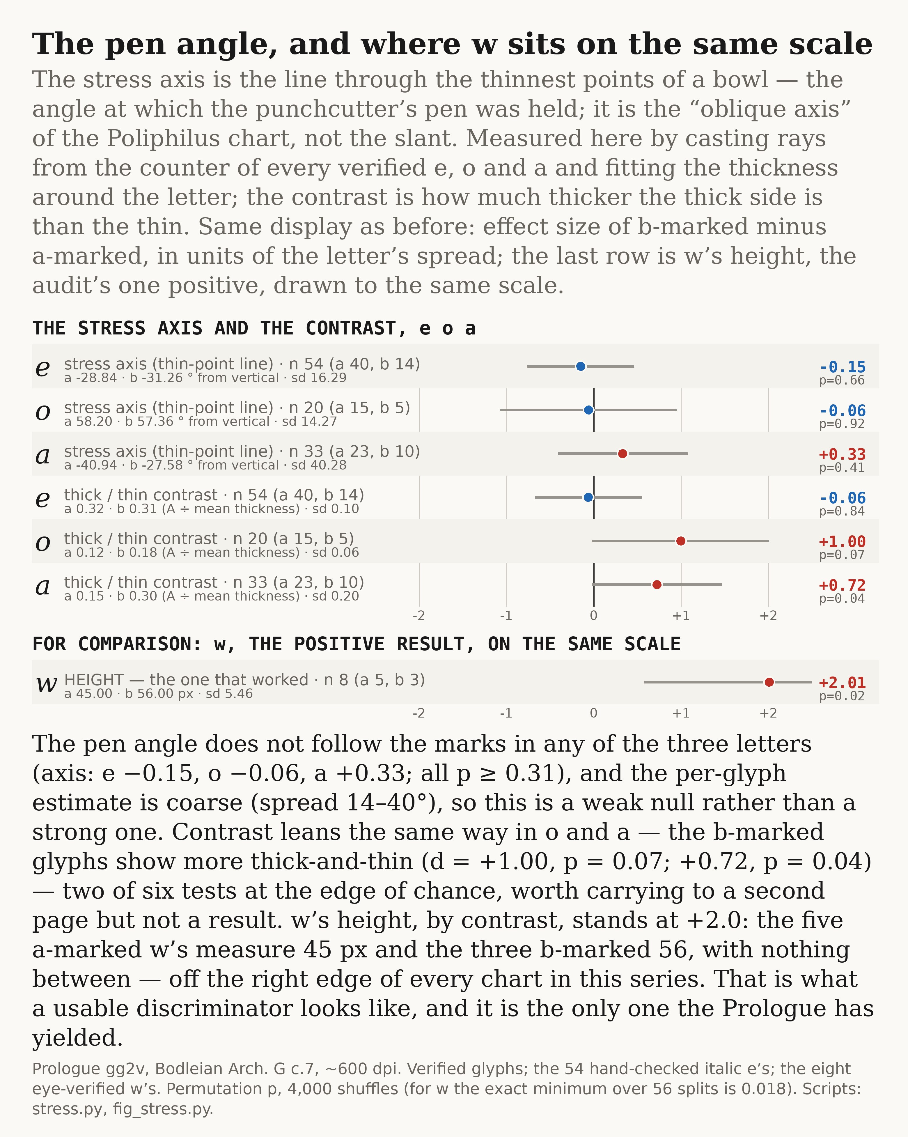
A type-designer’s quantity Riverbank never names: the line through the thinnest points of a bowl, which records the angle at which the punchcutter’s pen was held, and which two founts by different hands would be likelier to differ in than slope. Measured by casting ninety rays from the counter’s centroid, taking the thickness of the first ink run on each, and fitting a second harmonic; the thin direction is the axis and the amplitude over the mean is the contrast.
letter   n    axis a / b (°)      d      p     contrast a / b     d      p
e       54    −28.8 / −31.3    −0.15   0.66     0.32 / 0.31    −0.06   0.84
o       20    +58.2 / +57.4    −0.06   0.92     0.12 / 0.18    +1.00   0.07
a       33    −40.9 / −27.6    +0.33   0.41     0.15 / 0.30    +0.72   0.04
The per-glyph axis estimate is coarse (spread 14–40°) and its absolute values are not consistent across letters, so this is a weak null on the axis. Contrast leans the same way in o and a — the b-marked glyphs show more thick-and-thin — two of six tests at the edge of chance, recorded here and carried to the next page rather than claimed.
⚑ Where w stands on the same scale
w height (px), eight eye-verified glyphs
marked a   45 45 45 45 45          mean 45.0
marked b   54 57 57                mean 56.0
sd 5.5 · d = +2.01 · p = 0.021 (exact minimum over 56 splits 0.018)
Beyond the right edge of both rules charts. The next largest figure anywhere in this issue is o’s ink area at +1.10, one of the two chance hits on twenty glyphs.
⚑ The Digges test: a defect, and the re-run
The 5 September cross-page test reported PASS with height |r| = 0.73, p = 0.018. Assembling the figure for this issue required drawing the eleven glyphs, and the drawn glyphs were incomplete. The cause: at the Digges leaf’s 330 dpi, Sauvola binarisation breaks most w’s into two or three components, and runtest.py kept only the component under the box centre.
glyph   components   ink kept by the centre rule
#0          3             35%
#1          1            100%
#2          2             66%
#3          2             64%
#4          3             41%
#5          2             60%
#6          3             48%
#7          1            100%
#8          2             61%
#9          2             63%
#10         2             61%
Re-run with every component inside the box kept and nothing else changed (runtest_union.py):
n = 11 · blind split 7 / 4
glyph width       |r| = 0.96
GLYPH HEIGHT      |r| = 0.94   permutation p = 0.0037
ink density       |r| = 0.84
amount of ink     |r| = 0.27
line / y / x      |r| = 0.12 / 0.12 / 0.11
heights   small group  23 24 24 24 24 24 26 · large group  28 30 31 31   (no overlap)

registered wording: height strongest, |r| > 0.7   →   technical FAIL (width fractionally stronger)
substance: two sizes of w, separable blind, on a page nobody marked
The master list
Every criterion Riverbank published, with page reference and status, is kept as one document in the lab repository (riverbank-discriminators-master-list). Of the eleven shape rules, ten are measured and null on the Prologue; one is positive for w alone and by a feature the rules do not name; the eleventh, long-tailed letters, wants more glyphs than this page has. The procedural rules — frequency, redefinition until it decodes, context, reversal, dot-inversion, roman carriers, digraphs — are not shape criteria and cannot be measured, only quoted.
What this does not show
- That no discriminator exists. Ten of Riverbank’s eleven are null on one page; the eleventh and the rarer letters need other leaves.
- That the marks are wrong. They are Riverbank’s, confirmed twice, and they were produced by a method Riverbank itself describes; the finding is that no published rule of theirs reproduces them.
- Anything beyond the Prologue for any letter but w.
- Two founts of w is not a message.
Publication
hosting   GitHub Pages, branch main, served from the repository root
build     none — hand-written HTML, no framework, no generator
DNS       Namecheap BasicDNS · A @ 185.199.108/109/110/111.153 · www CNAME fb-decipherer.github.io.
TLS       Let's Encrypt, issued and renewed automatically
tracking  none — no analytics, no cookies, no third-party scripts
cost      one domain registration a year, and nothing else
Next, in order
- Re-run last week’s per-letter statistics on verified labels, and post the corrected sample sizes against the 5 September issue.
- The Catalogue and Actors leaves at full IIIF resolution, whole glyphs, for the w split and for the contrast lean in o and a.
- Riverbank’s per-passage Classifier plates (Keys, printed pp. 19–27), still unextracted: a second, independent exemplar set for every letter, including the bb pair.
- The two Riverbank monographs not yet read: Fundamental Principles and Ciphers for the Little Folks.
Standards this series holds itself to
- Predictions and falsifiers are written down before the data is looked at.
- Only open, re-fetchable data. No privileged access, no unique artefact.
- A determinate procedure, with every hand judgement named as such — the e clean-up and the roman exclusions above were done by eye and say so.
- Negative controls must return null.
- The null gets published in the same terms as a positive.
- Where the work cuts against the claim, it is said here first. Where it cuts against this project’s own earlier result, it is said here first too.